
Roman Cieślewicz (1930 – 1996)
Roman Cieślewicz was a Pole born in Lvov, the second half of whose relatively short, but very busy life spent in France, left us a large body of work in the field of graphic design. This is characterized above all by an enormous variety of techniques, motifs and subjects. In all his designs – in both the full iconographic references and quotes from early artworks, and those minimized and limited to sign messages – one can see a fascination with IMAGES in all their forms, the whole visual sphere available to man.
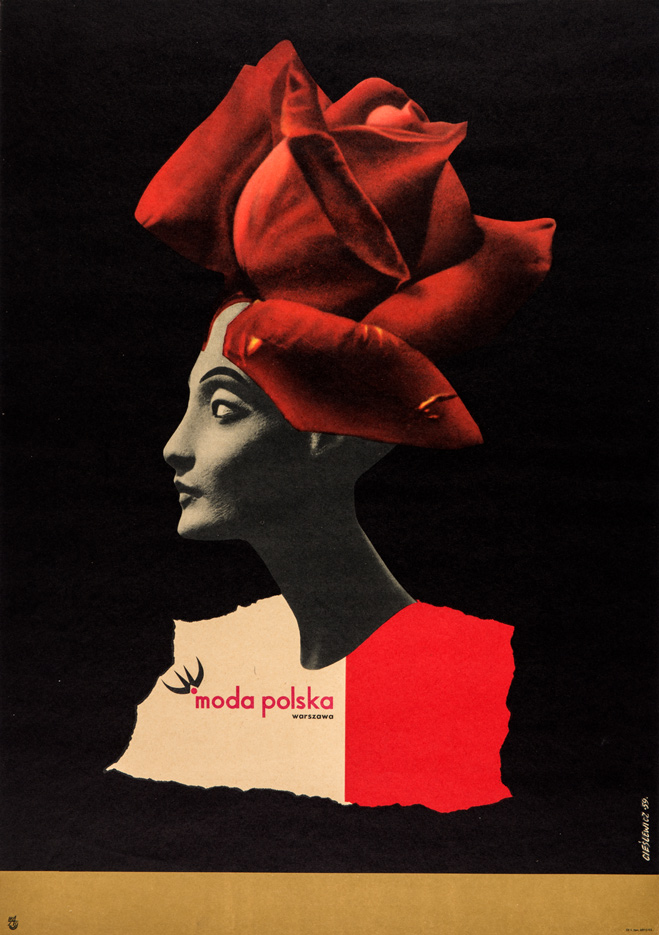
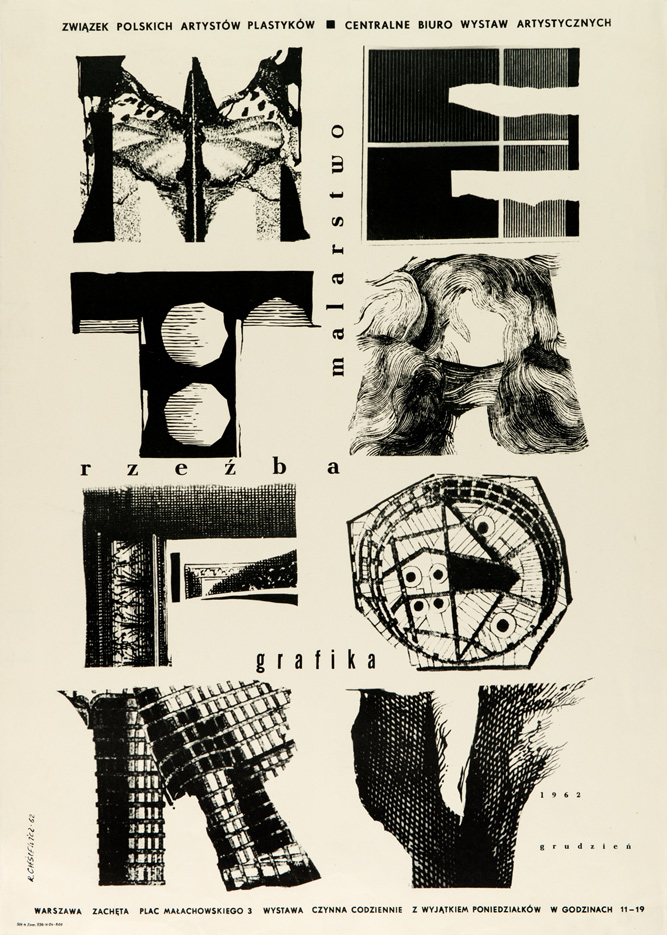
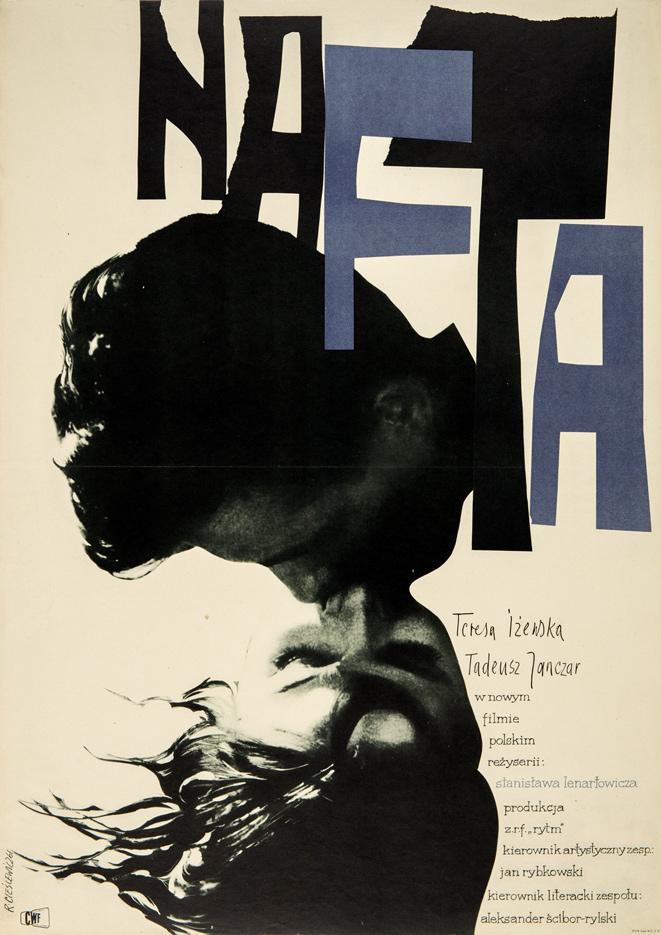
In the early fifties, when political posters dominated, Cieślewicz dreamed of designing movie and cultural posters. His move to Warsaw after graduation was therefore quite natural, as only there could he count on obtaining interesting commissions. From 1955, he designed mainly for the Film Lease Headquarters (Centrala Wynajmu Filmów CWF), the Graphic Arts Publishing House (Wydawnictwo Artystyczno-Graficzne WAG)1 and the Bureau of Art Exhibitions (Centralne Biuro Wystaw Artystycznych). Of these, the most interesting group were his movie posters for the Film Lease Headquarters, which permitted a relatively loose interpretation of the subject matter, like in The Destroyers of Aeroplanes (Niszczyciele samolotów, 1955); The Birth of Menyhérrt Simon (Zanim Simon ujrzał świat, 1955); Red meadows (Czerwone łąki, 1956). In 1959, he designed for the state-owned enterprise Moda Polska (Polish Fashion) one of the best advertising posters (pub. WAG) in the history of this genre in Poland. Neither the poor print quality, nor the fictitiousness of the advertising claims – characteristic of the period, detract from the design. Executed using the photomontage technique, it operates with a clear visual abbreviation, while its otherness continues to surprise.
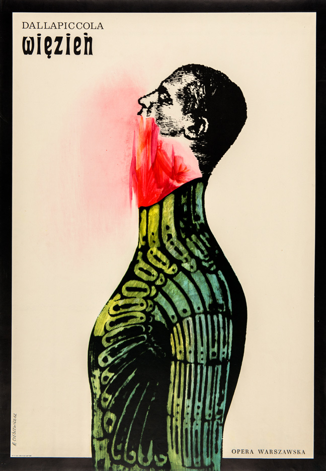
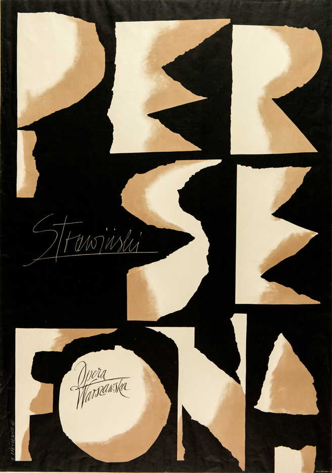
In addition to posters, for which he had no lack of orders, Cieślewicz designed album and book covers for the publishing houses PIW and Iskry, and in 1959 began an important collaboration with the newly established monthly Ty i Ja. As the graphic editor of a magazine, whose formula was for those times exceptionally open, he could experiment and introduce ever newer ideas. He studied hard, picking up ideas from Western magazines, used various design systems and for the first time introduced his own photomontages as illustrations and covers, which rotogravure printing technology endowed with an extraordinary dignity. The essential thing this experience taught him were the immense possibilities of creative publishing graphics. The artist’s fascination with this field of activity gradually developed, and a subsequent trip to Paris gave him the opportunity to further experiment with photomontage, which in time became the dominant technique in his work. Working intensively until 1963 in the editorial offices of Ty i Ja, he did not neglect poster work and achieved a level of mastery in several designs for the Warsaw Opera. In the posters for Manru (1961), Persephone (Persefona, 1961) and The Prisoner (Więzień, 1962), his graphic interpretation of theatrical subjects was far removed from mere illustration. Posters for the Opera, regularly winning awards in the competitions for Best Poster of the Month, informed passers-by of cultural events and at the same time provided them the chance to view a fresh and intriguing artistic form. His Persephone joined the Museum of Modern Art’s collection in New York, and in 1971 was presented at its international poster exhibition “World and Image“. In that period when the poster artist was continuously acquiring new design experiences, he never lacked work in the field of exhibitions. One of the first was the award-winning joint design of the Polish pavilion at the international exhibition “Expo ’58“ in Brussels.
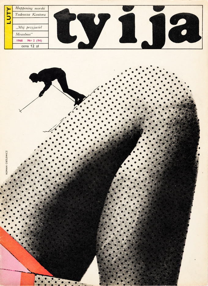 Cover Ty i Ja monthly, No. 2, 1968
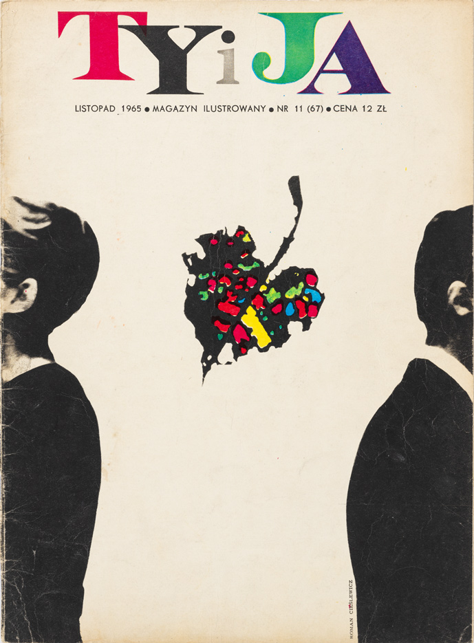 Cover Ty i Ja monthly, No. 11, 1965
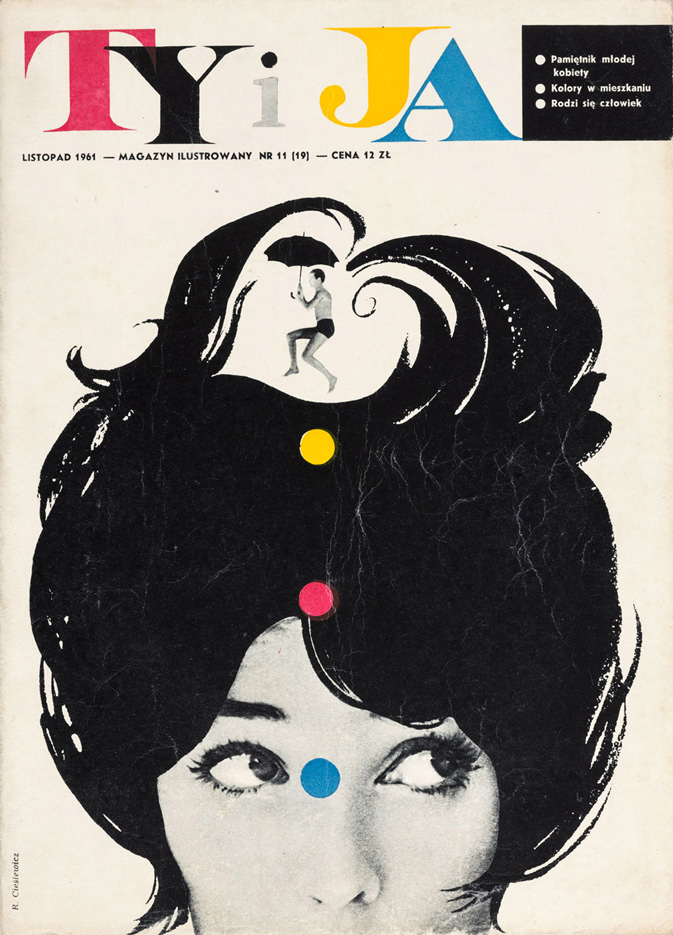 Cover Ty i Ja monthly, No. 11, 1961
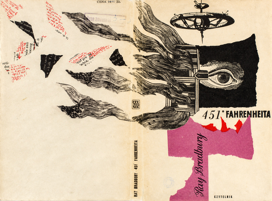
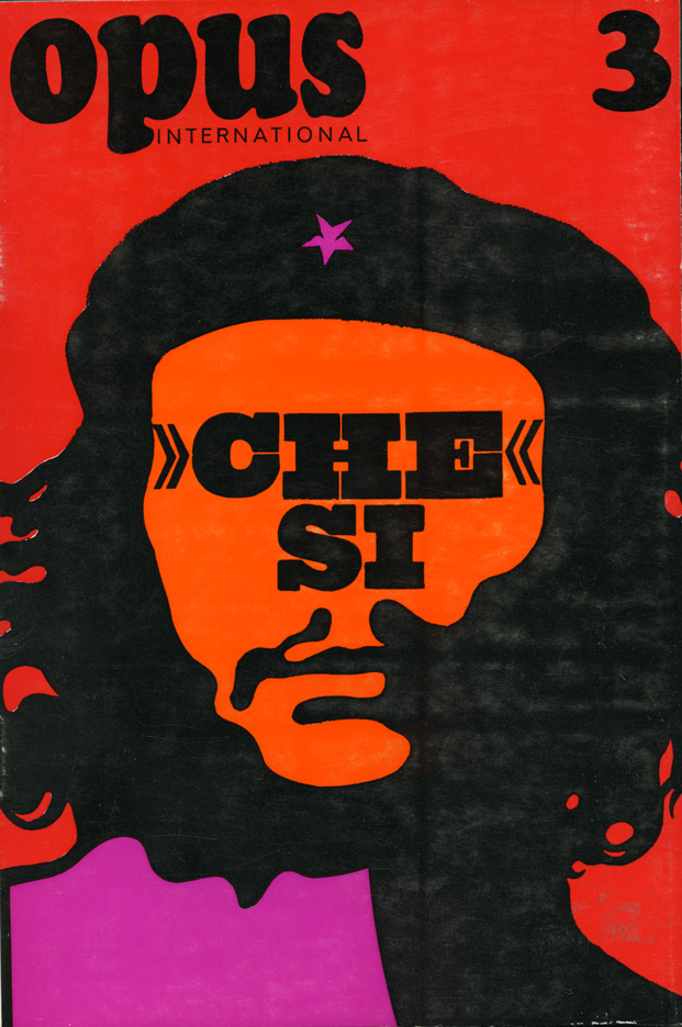
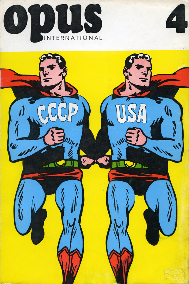
1963 was a special year in the artist’s career. He completed work on a series of illustrations for Bruno Schulz’s The Street of Crocodiles (Sklepy cynamonowe), though the design did not meet with a favorable reception on the part of the literary critics in Poland and the book never went to print2. At the invitation of the Krupp Company, issued following a presentation of his work in the album Polnische Plakatkunst, edited by Józef Mroszczak, he went to Essen, where he was commissioned to design the company’s advertising graphics. Within three months of leaving the country, Cieślewicz was in Paris, where he was to remain permanently: “I started working [for Elle] as a graphic designer with no particular function. I simply did layouts. I printed a lot of illustrations, photomontages and collages. I didn’t speak a word of French, but I went with my wife, who had been to Paris before and spoke the language. She has since passed away – she was the sculptor Alina Szapocznikow.”3 Working in Elle, he established contacts and worked with the best professionals, including with photographers Ronald Traeger and André Carrara. For a year, he also worked on the layout of the monthly magazine Vogue and obtained commissions from French publishing houses. One of the most important was the Parisian publisher Georges Fall, for whom he developed the graphic concept of Opus International, a magazine of the intellectual left that considered the arts in the context of social conditions. Cieślewicz’s covers for the first issues, also published as A1 format posters, became icons of graphic design. Graphic images of the Mona Lisa without a face, Che Guevara or two Supermen symbolizing the United States and the Soviet Union, became fixed in the collective memory. After leaving Elle in 1969, the artist became involved with the Parisian Style and Advertising Agency M.A.F.I.A. This change of job, for fear of falling into a rut, was another manifestation of his very strong need for continued development. From 1972, Cieślewicz worked as a freelance designer, which guaranteed him total freedom to create his own graphic “provocations.”
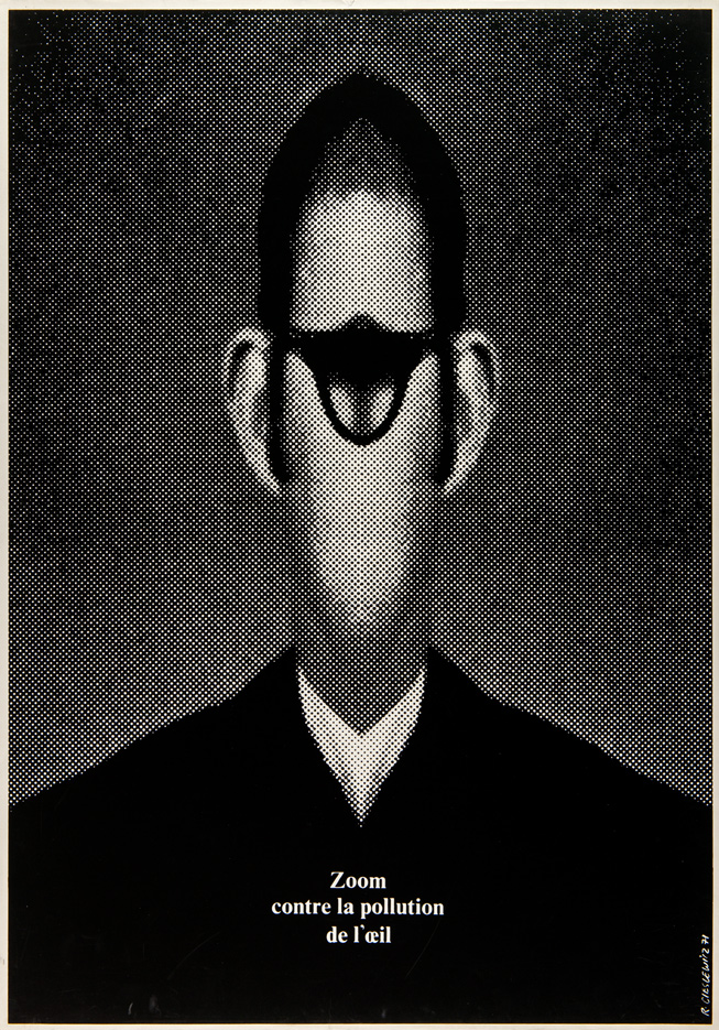
Photography was already expanding Cieślewicz’s graphic techniques at the beginning of the sixties, and his approach to photographic material based on “encoding images” was present in his advertising works as much as those arising purely out of his passion to create. He often stressed that photographs were his material of choice, “almost a biological part of him,” and its structure gave him infinite possibilities for experimentation. In his series of repetitious collages, Cieślewicz’s images of people he knew and characters drawn from the iconography of the press (e.g. Jean-Luc Godard and Batman), graphically processed and multiplied, began to function as signs. Another stage in his penetration of photographic material was his Symmetrical Figures (Figury symetryczne) – a series of serigraphs executed from the early seventies. This series began with a press advert for the magazine Zoom, presenting a one-eyed monster. The screen printing poster Zoom contre la pollution de l’oeil (Zoom against Eye Pollution, 1971) with an identical composition, won the artist the gold medal in the social poster category at the 4th International Poster Biennial in Warsaw in 1972.
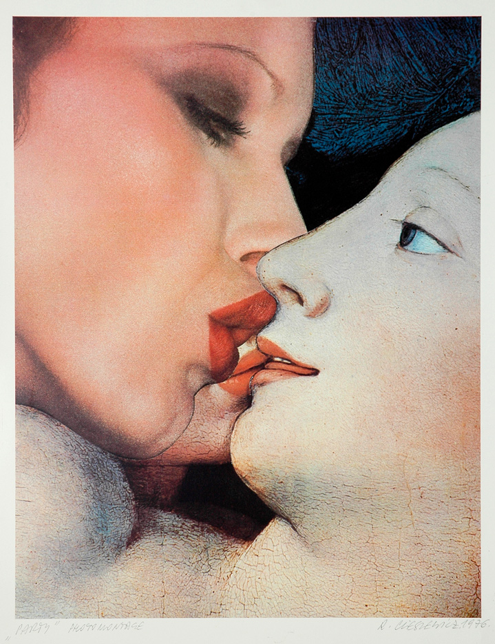
In 1975, the PIW publishing house commissioned Cieślewicz to do photomontage illustrations for the Ann Radcliffe book The Mysteries of Udolpho (Tajemnice Zamku Udolpho). In this case, he abandoned the symmetry convention and turned to motifs from early paintings. For the first time, he used direct quotes from early artworks and once again since his illustrations for Schulz’s prose, he proposed his own interpretation of literature, based on free associations. A further result of his “photomontage way of thinking” was the series of prints entitled Change of Climate (Zmiana klimatu), begun in 1976. In this, Cieślewicz created his own saturated vision of a world full of tensions, but somehow tamed and given a “name.” These works of a uniform character, often mocking, with deep philosophical undertones, are also visually very appealing, tempting the eye with colors and unusual graphic effects achieved by combining the image of the world enclosed in European painting with its modern image, lifted from adverts and press photography. They are rich in content, and their poetics, based on free associations, are further enhanced by his selection of titles. Despite the not always favorable reviews, in which Cieślewicz was sometimes criticized for the mere fact of violating the “sanctity of painting masterpieces” he created photomontages visually related to this series for a number of years, and adapted them many times to various publishing tasks.
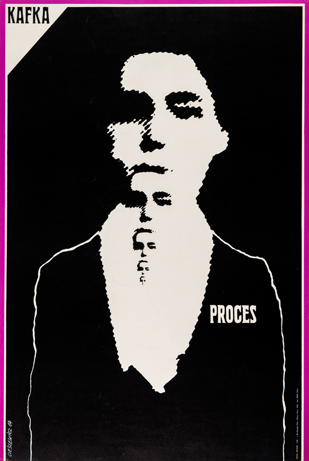
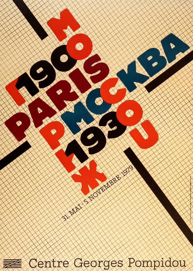
From 1973, when Pontus Hultén took over leadership of the Centre National d’Art Contemporain (CNAC) in Paris, Cieślewicz’s earlier established cooperation with that institution expanded. He designed the visual identification of large retrospective exhibitions organized by the CNAC, and in some cases, the exhibition layout. This was a novelty in the normal publishing practices in Paris. An example is the poster drawing on constructivist typography for the exhibition Paris – Moscou 1900–1930. Elements of constructivist graphic solutions at that time began appearing more frequently in the various designs of the artist, who never disguised his fascination with the avant-garde art of the twenties and thirties. His works most often recalled the innovative typography of the periodicals Blok, Nowyj Lef or Zwrotnica and the photomontages of Aleksandr Rodchenko and Mieczysław Berman.
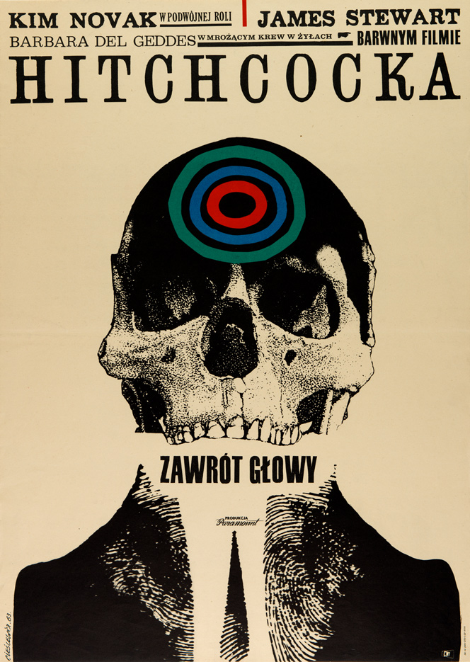
In the eighties, he again became involved in advertising, which resulted in two particularly successful designs: an advertising campaign for Charles Jourdan shoes and a promotional folder for the DAYN Company of Saudi Arabia. In both designs, he used photographs in a completely different way.
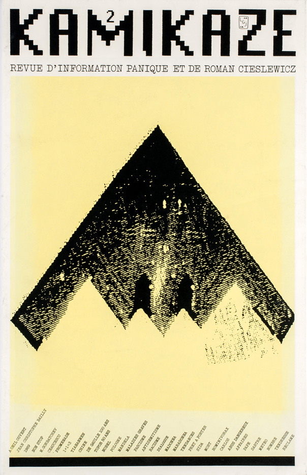
He used photomontage in three successive solo publications in the series Kamikaze, Revue d’information panique ét de Roman Cieślewicz (Kamikaze. Roman Cieślewicz’s panic information magazine). Their dimensions (12,5 x 19,5 in) correspond to the format of a common daily, but the text, reduced to brief comments and inscriptions, and the unusually large photographs at once indicate that this is no ordinary newspaper. In the first issue in 1976, Cieślewicz for the first time used unadulterated photographs. He selected these from a mass of “irrelevant” and transient images, and then confronted them with each other in such a way that a “tenseness of thought was created.” In another notebook on the eventful year of 1989, the artist reveals the banality of images and their myth-making role, and exposes trends and fashions. He used an equally unknown graphic language – ascetic and simple – in the series of photomontages Pas de Nouvelles – Bonnes Nouvelles (No news is good news) that he executed between October 1986 and February 1987. These publications, arising not though commissions, but as his own projects, guaranteed complete creative freedom, which in turn ensured the artistic coherence of the whole: “Kamikaze is a risky undertaking, but it gives me the luxury and freedom to do what I want from A to Z, and for that I alone am responsible from A to Z.”4
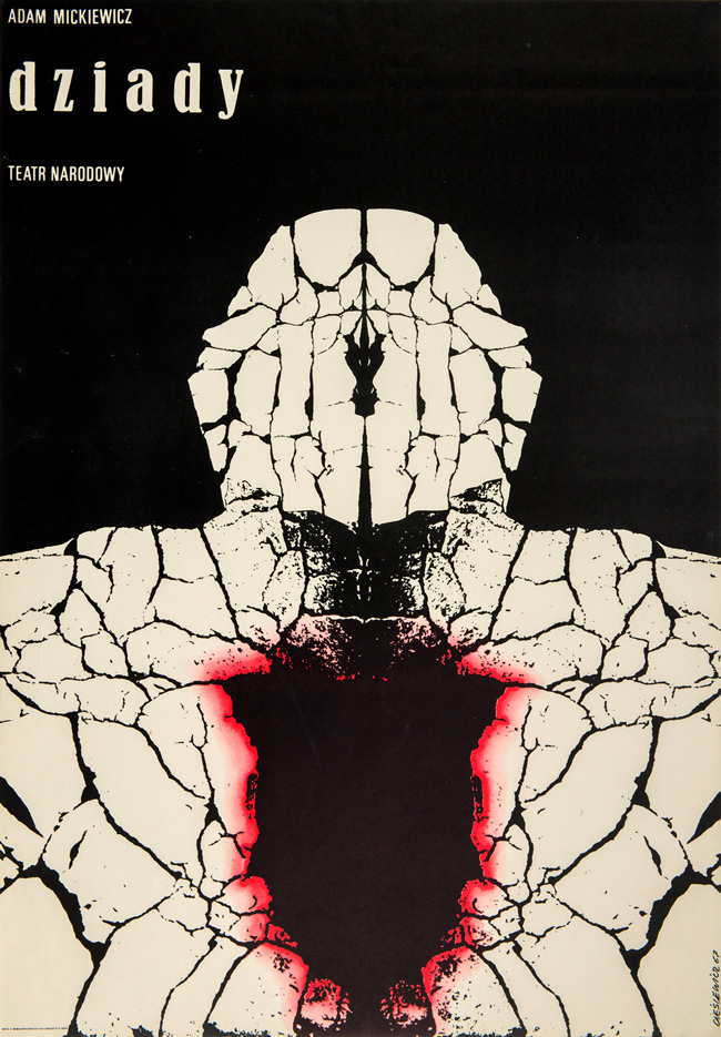
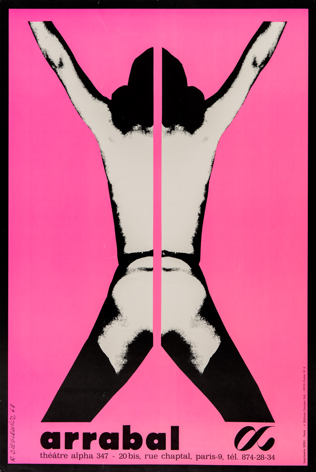
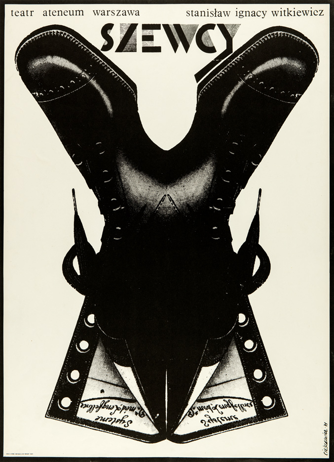 Poster The Shoemakers. Stanisław Ignacy Witkiewicz, for Atheneum Theater in Warsaw, 1971
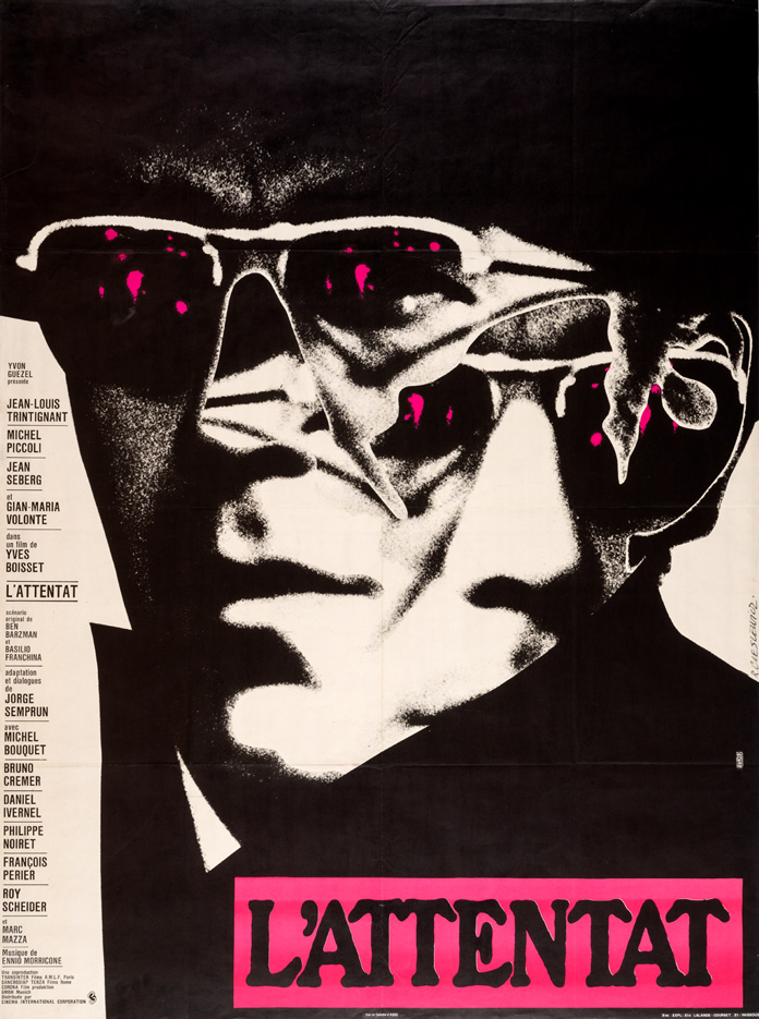 Poster L'Attentat, for Cinema International Corporation in Paris, 1972
The path indicated by subsequent issues of Kamikaze led in 1991 to regular cooperation with the daily Liberation and the monthlies Révolution and L’Autre Journal. For the latter in 1992, the artist, using minimum graphic means, designed the poster Quoi de neuf? (What’s new?), referring to the growing popularity of extreme right-wing views in France. Minimalism, in addition to the posters, also features in his illustrations from the series Petites images (1990–1994), often on social and political topics, which he published in the French press, and presented for the first time at an exhibition in Paris in 1997.
His great success was to restore the power of the graphic symbol, which he used in all his works, most evidently in his later period. Tackling lively current issues, and regularly commenting on the reality around him, he fulfilled the conditions to be called an involved artist. Roman Cieślewicz as a man was open and always learning, seeking his own path, while still very much in touch with everyday life. The complexity and richness of his artistic (or – as he would have liked to put it – “craftsman’s”) attitude continues to fascinate.
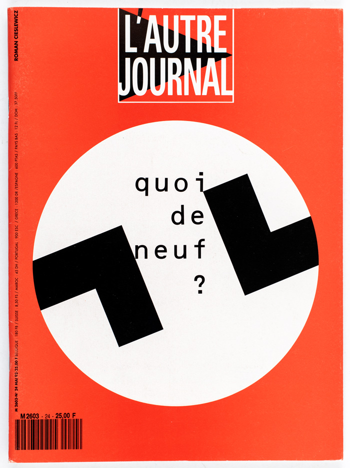 Cover L'Autre Journal monthly, No. 24 May, and poster Quoi de neuf?, pub. Alter in Paris, 1992
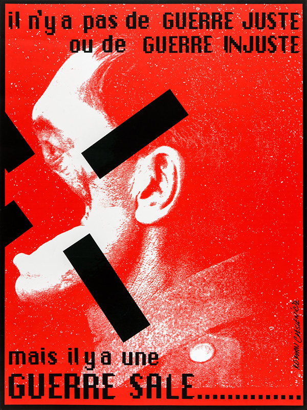 Poster Il n'y a pas de guerre juste ou de guerre injuste, mais il y a une guere sale ..., for Centre International Contre La Guerre in Verdun, 1994
1. As early as 1955, he received the Graphic Arts Publishing House’s Tadeusz Trepkowski award for his lifetime achievements in the field of poster.
2. In one of his letters, Roman Cieślewicz mentions that thanks to, among other things, the exhibition of these illustrations in the Mandragore gallery in Paris in the autumn of 1963, he was given the opportunity to stay there and work in his profession. See: Z. Schubert, [introduction], in: Roman Cieślewicz. Plakaty, fotomontaże, Muzeum Narodowe, Poznań 1981 [exhibition catalog].
3. See: J. Żakowski, “Dwa palce, rozmowa z Romanem Cieślewiczem, byłym redaktorem graficznym Ty i Ja, Vogue, Elle“, ITD 1981, No. 32, pp. 16–17.
4. J. Sitkowska, “Wywiad z Romanem Cieślewiczem“, Projekt 1995, Nos. 202–203, pp. 54–70.
Article published in the book VeryGraphic. Polish Designers of the 20th Centry edited by Jacek Mrowczyk.
Copyright © Instytut Adama Mickiewicza, Warszawa 2015
ISBN 978-83-60263-18-1